Cross-Stitch Color Palette Selection Guide (Choose Colors That Actually Work)
How to choose a cross-stitch color palette that looks good and stitches well — color count, value over hue, brand choice, and how to build a palette from the floss you already own.
Color is the thing people notice first about a finished piece and the thing that quietly ruins more projects than any other. Too many colors and you get a confetti nightmare that's slow, expensive, and muddy from a distance. Too few and the piece falls flat. Pick the wrong values and a portrait turns into a stranger. A good palette is invisible — it just works — and getting there is a skill worth building.
This guide covers the principles that separate a palette that sings from one that fights you, the hard cases (skin tones, greens, that one impossible blue), and a genuinely different way to plan a palette: starting from the floss you already own instead of picking colors blind. You can try StitchThis free and build a palette as you read.
The core trade-off: color count
 Almost every palette decision comes back to how many colors. More colors mean more nuance and more realism — and more confetti, more skeins to buy, more thread changes, and a slower stitch. Fewer colors mean a bolder, faster, cheaper piece that can look flat if you cut too far.
There's no magic number, but some honest ranges:
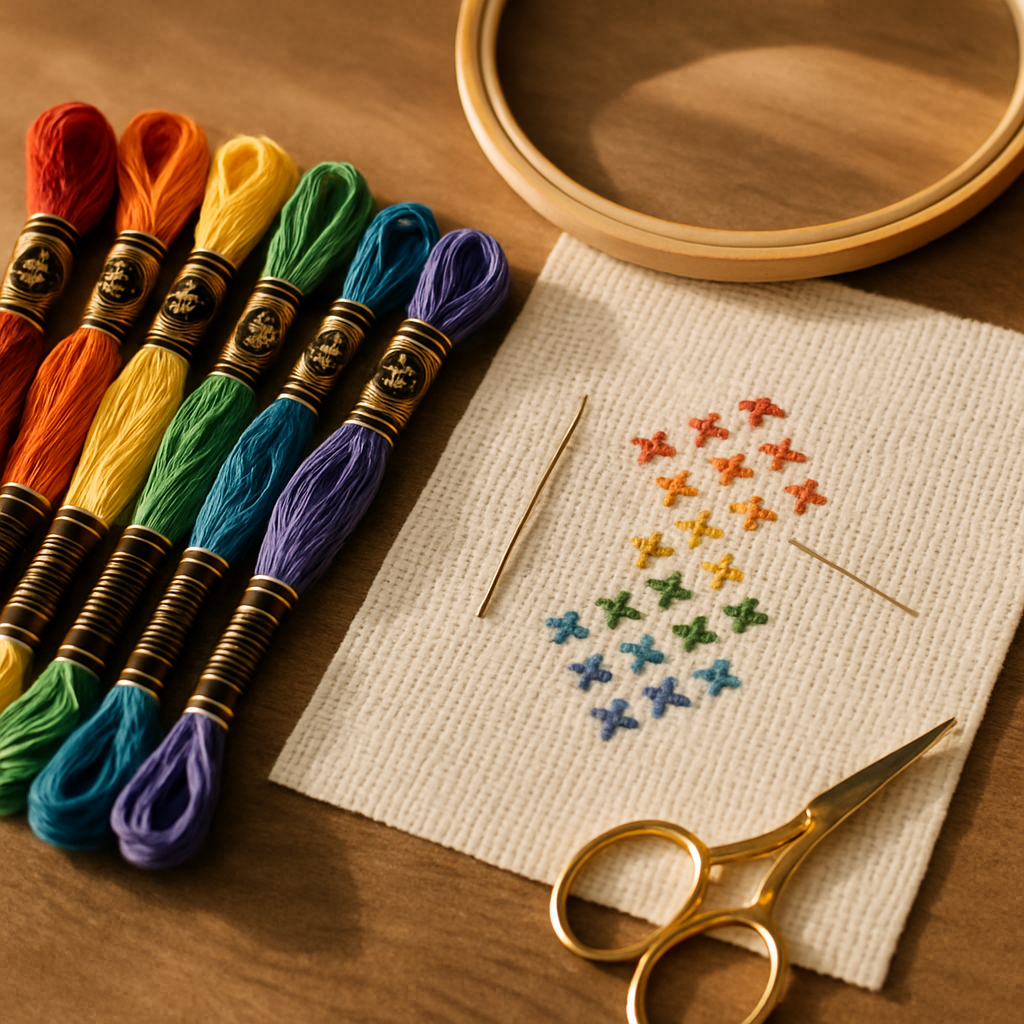
- A bold, graphic design (an illustration, a logo, simple motifs): often gorgeous at 5–15 colors.
- A stylized portrait or landscape: typically 20–40 well-chosen colors.
- A photorealistic piece: can run 50+, but every color past the point of visible difference is pure cost and confetti for no payoff.
The skill isn't using more colors — it's using the right ones. A tight, deliberate palette almost always beats a sprawling one. If confetti is your enemy here, our confetti survival guide is the companion read.
Value matters more than hue
 Here's the principle most beginners miss: value — how light or dark a color is — does more work than hue — what color it actually is. Your eye reads form from value contrast. A portrait with perfect skin-tone hues but flat values looks dead; one with strong light-to-dark structure reads even if the hues are slightly off.
The practical test: squint at your palette (or your reference image). When you squint, hue washes out and you see only light and dark. If the values all blur into one gray mush, your design will look flat no matter how pretty the individual colors are. You want a clear spread from your lightest light to your darkest dark.
When you're trimming a palette, group by value: if two colors are nearly the same lightness and hue, you almost certainly don't need both.
The hard cases
 A few subjects fight back, and they're worth knowing in advance:
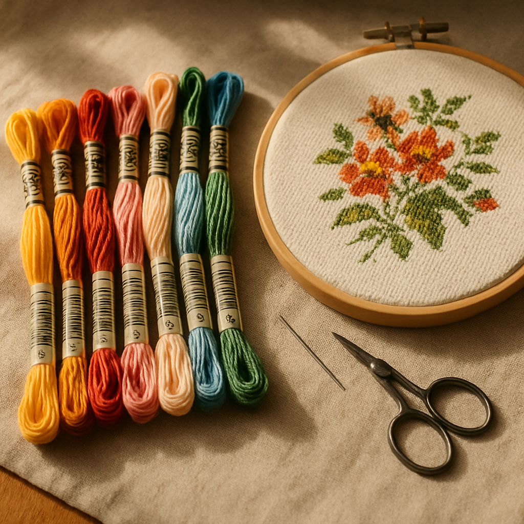
- Skin tones. The trap is going too pink or too orange. Real skin is more desaturated and varied than people expect, and it lives on subtle value shifts. Keep the values structured and resist over-saturating.
- Greens (foliage, bouquets). A real garden has far more greens than you'd guess, and they're easy to over-collect. Pick a tight family — a light, a mid, a dark, maybe a yellow-green accent — rather than fifteen near-identical leaves.
- Skies and gradients. Smooth blends become confetti fast. Decide how many bands of color you'll allow and commit, rather than chasing every subtle shift.
Brand matters too
The same "red" isn't identical across brands. DMC, Anchor, Cosmo, Gamma, Madeira, and Metro each have their own color ranges, and a conversion between them is approximate, not exact. So part of palette selection is simply picking your brand and choosing within its actual range — not building a palette in DMC numbers and hoping your Anchor conversions land. We compare two of the big ones in our DMC vs Anchor floss guide.
StitchThis lets you chart against multi-brand palettes directly, so you select real, buyable colors in whatever brand you actually stitch with — no manual conversion roulette.
The better way: build your palette from the floss you already own
Here's where palette planning gets genuinely smarter. Most tools — and most tutorials — have you choose colors in a vacuum, then hand you a shopping list of 40 skeins, half of which are sitting in your drawer already. StitchThis flips that around: it plans the palette around your stash.
It starts with the floss stash tracker, which knows what you own (our floss stash organization guide covers setting it up). And because nobody wants to hand-enter 200 color numbers, there are two fast ways to load it: import a CSV from the stash spreadsheet you probably already keep, or photograph your skeins to bring them in. Once your stash is in, three things change:
- Generation biases toward what you have. When StitchThis builds a pattern, it leans toward colors already in your stash — so your palette is built from thread you can pull out of the drawer tonight, not a 40-skein shopping trip.
- You get a shopping list for only the gaps. Every pattern produces a floss list, and checked against your stash, it tells you exactly which colors you still need to buy — not the whole palette, just the missing pieces. Less money spent, less duplicate thread.
- You can swap to stash colors in the viewer. Open the pattern in StitchThis's viewer-editor and, if a called-for color is one you don't have, use Change All to replace every instance of it with the closest color you do own. Re-palette a finished chart to your drawer in seconds.
Why StitchThis owns palette planning: multi-brand palettes to pick real floss, StitchSense to hold detail where it matters so you can trim elsewhere, quality presets to control color count, and a stash-aware workflow — generation biased to your stash, a shopping list for just the gaps (CSV or photo import to set it up), and Change All to swap any color to one you own. Palette planning that starts from your drawer, not a blank slate. Start free →
Choosing a palette from a photo
When your palette comes from a photograph, the conversion does the first pass for you — StitchThis turns your source photo into a faithful pattern with a palette derived from the image. Two levers keep it from ballooning:
- Quality presets let you dial the color count from simplified to full, so you choose how rich the palette gets.
- StitchSense preserves the detail in the focal point, which means you can trim the palette aggressively in the background without losing the face or the subject. Spend your colors where the eye looks.
The result is a palette that captures the photo without drowning you in fifty near-identical shades. (More on photo conversion in our free patterns from your photos guide.)
A quick palette-selection checklist
- Decide your color-count target for the design's complexity
- Check the value spread — squint; is there a clear light-to-dark range?
- Merge colors that share both value and hue
- Pick your floss brand and select within its real range
- Plan against your stash — generate toward what you own, shop only the gaps
- Watch the hard cases: skin tones, greens, gradients
- Confirm how much of each color you need before buying (floss amounts here)
Frequently asked questions
How many colors should a cross-stitch pattern have? It depends on the design: 5–15 for bold graphic work, 20–40 for a stylized portrait, 50+ only for photorealism. Past the point of visible difference, extra colors just add cost and confetti.
How do I choose cross-stitch colors that look good together? Focus on value first — make sure your palette has a clear range from light to dark (squint to check). Then keep hues cohesive and merge any colors that are nearly identical in both lightness and shade.
Should I use DMC or another brand? Pick the brand you can actually buy and stitch with, then choose within its range. Conversions between brands are approximate, so building directly in your brand beats converting from someone else's numbers. StitchThis supports DMC, Anchor, Cosmo, Gamma, Madeira, and Metro.
Can I build a palette from floss I already own? Yes — that's a StitchThis strength. Load your stash (import a CSV or photograph your skeins), and it biases pattern generation toward colors you have, gives you a shopping list for only the missing ones, and lets you swap any color to a stash color with Change All.
Why does my palette look flat? Almost always a value problem — the colors are too close in lightness. Add contrast between your lights and darks. Hue variety can't fix a palette with no value structure.
Pick colors like you mean it
A great palette is a series of small, deliberate decisions: the right count, real value contrast, a committed brand, and — the part that saves real money — a plan built around the floss already in your drawer. Get those right and the colors disappear into a piece that just looks right.
Try StitchThis free to build a stash-aware palette and shop only for what you're missing.
Ready to turn your photo into a cross-stitch pattern?
Try StitchThis freeTwo patterns per month. No card required.