Why Some Cross-Stitch Patterns Feel Miserable to Stitch (and How to Avoid Them)
Why some cross-stitch patterns feel impossible to finish — the failure modes (confetti, symbol collision, fractional bloat), the stitchability spectrum, and how to spot them before you buy.
You've been working on a pattern for two weeks. You've stitched maybe a thousand crosses. You look at the fabric and the design is barely visible. The thread you finished an hour ago you'll need to re-thread two stitches later because there's exactly one square of it in the next inch of pattern. Your eyes hurt. Your back hurts. And the truth you don't want to say out loud is creeping in: I hate this.
This isn't a personal failing. It's not that you "aren't good at cross-stitch yet" or that you "should have picked something simpler." It's almost certainly that the pattern you're stitching was built badly — designed (or generated) without anyone thinking about whether the resulting chart was actually pleasant to follow. Patterns vary enormously in quality, and the difference between a well-built pattern and a poorly-built one is the difference between cross-stitch as a relaxing hobby and cross-stitch as a punishment.
This article is about how to identify the problem so you can stop blaming yourself, what the specific failure modes look like, and how to pick or build patterns that don't do this to you in the future.
It's the pattern, not you
 A few signs the pattern is at fault and not your skill level:
- You're constantly threading and re-threading the same colors with one or two stitches between each use
- After hours of work, the design on the fabric doesn't look noticeably more complete
- You're squinting at the chart trying to tell two adjacent symbols apart
- A whole row took you half an evening and you had to redo a section because you miscounted
- You started excited and now you're avoiding picking it up
- The colors on the fabric don't visually match the legend, because the colors in the pattern are too close together to render as anything but a smudge
Skilled stitchers feel all of this with bad patterns too. The frustration isn't a measure of your ability — it's a measure of the pattern's design quality. There's a vocabulary for what's gone wrong, and once you can name it, you can both diagnose what you're dealing with now and avoid it next time.
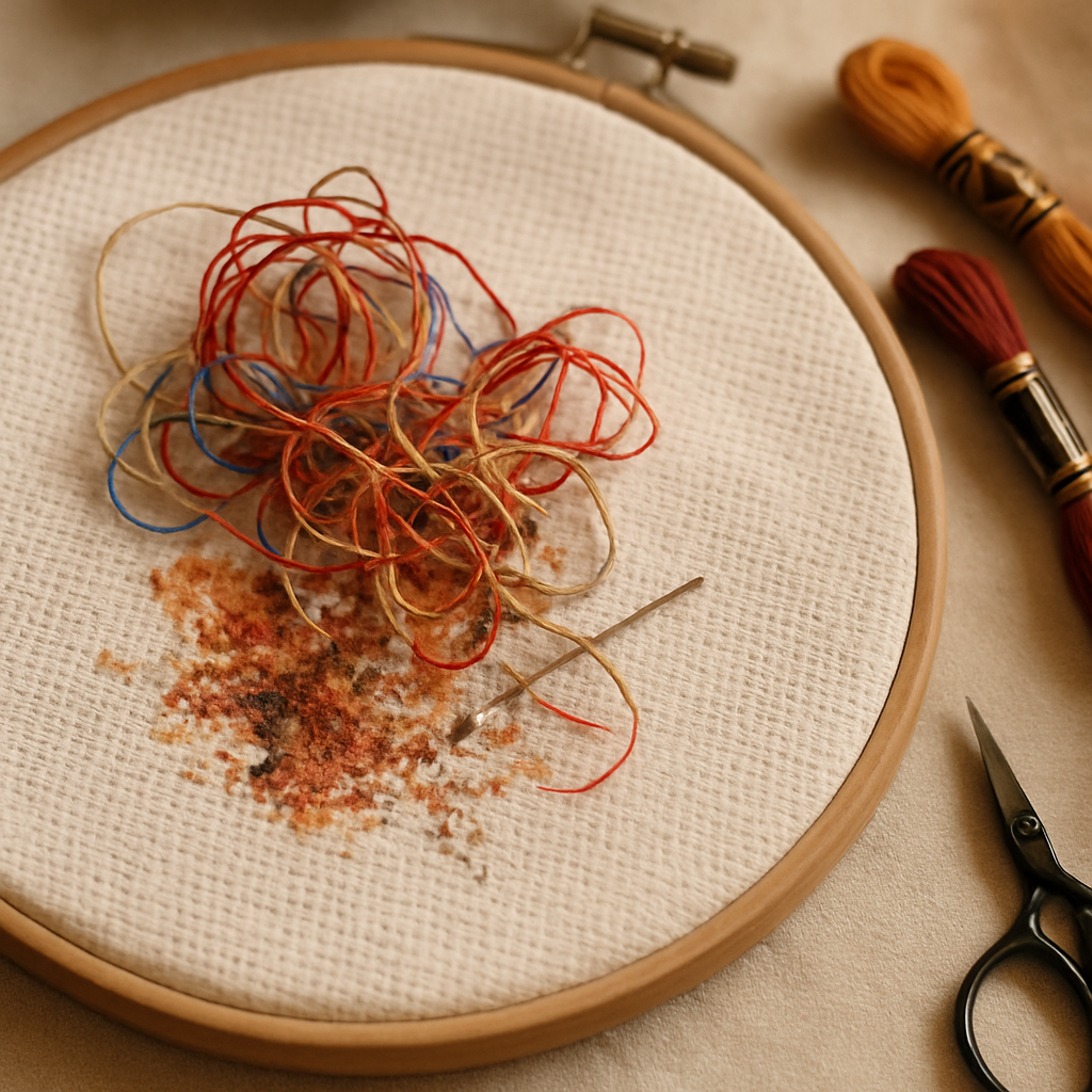
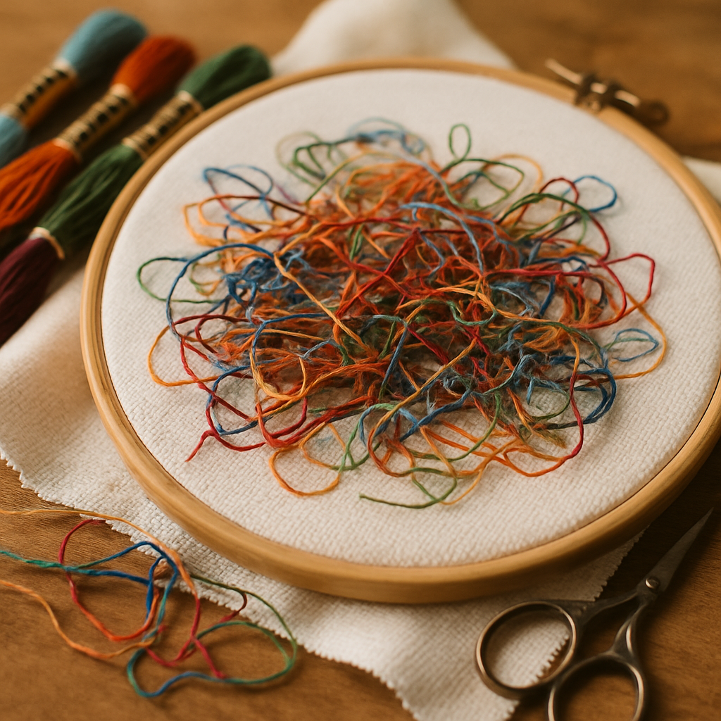
What confetti actually is
 Cross-stitchers use "confetti" to describe patterns with lots of isolated single stitches of one color scattered through areas of another color. Picture a portrait pattern where the cheeks are mostly DMC 754, but there are individual stitches of DMC 945, 3779, 754, 951 scattered through that cheek area to render skin-tone variation. From a few feet away, the finished piece looks beautifully nuanced. From the stitcher's chair, it's torture.
Each one of those isolated stitches costs you:
- Threading time. You finish a stitch of one color, swap to the new color for a single stitch, then swap back. Each swap is a 30-second operation involving cutting, re-threading, knotting. Multiply that by hundreds of confetti stitches and you've added hours to the project that produce no visible progress.
- Counting risk. Isolated stitches are easy to miss. You count "okay, two squares right, one square up, stitch," and the chance you put the stitch in the wrong cell is much higher than for a block of the same color where you can stitch in rhythm.
- Visual disappointment. A single stitch of a contrast color in a sea of another color often doesn't read on the finished piece the way the chart suggested it would. You did the work; the result doesn't justify it.
Confetti isn't categorically bad. Some confetti — used sparingly, in the right places — adds genuine nuance to a piece. The problem is patterns where confetti is the dominant feature rather than a strategic accent. That's a sign of a pattern generated without anyone considering the stitcher.
The five failure modes
 Confetti is the best-known failure mode but it's far from the only one. Five distinct failure patterns make up most of the "miserable to stitch" experience:
1. Confetti dominance. As described above — isolated single stitches of contrast colors scattered through large blocks. Sign: more color swaps than stitches per square inch.
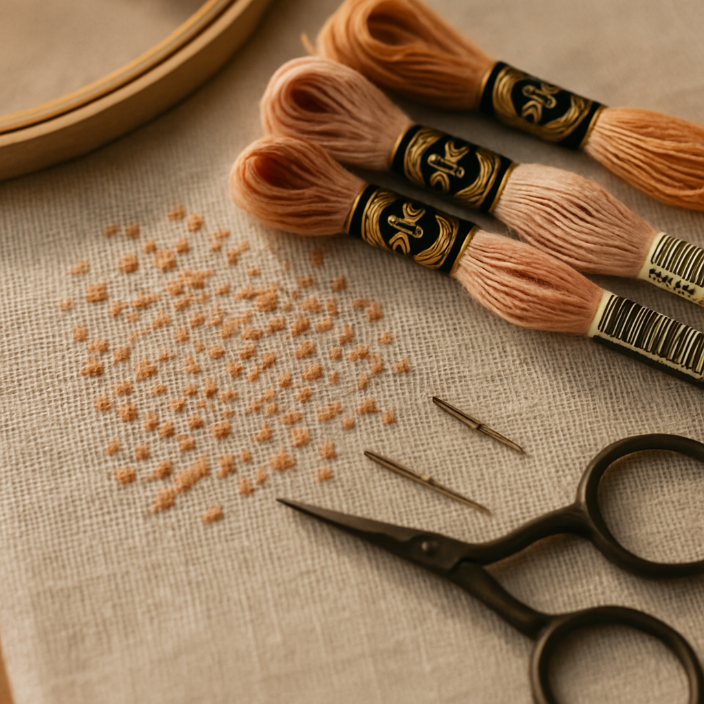
2. Micro-blocks. Tiny clusters (two to four stitches) of unique colors used to render small details that won't actually render at that fabric count. A two-stitch patch of mid-tone won't appear as a "subtle highlight" on 14 count Aida; it'll appear as nothing. Sign: lots of legend entries with single-digit total stitch counts.
3. Symbol collision. Two or more colors in the legend assigned visually similar symbols, especially when those colors are also similar in hue. Sign: you keep going to the chart to double-check whether the symbol you're looking at is ★ or * or ✱. The pattern designer didn't audit the symbol assignments against the actual color groupings in the chart.
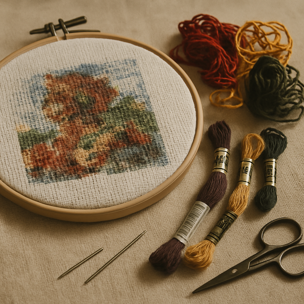
4. Gradient creep. A pattern attempts to render a smooth color gradient (sky, skin, fabric folds) using 12+ closely-related shades. On 14 count Aida the eye can't distinguish individual stitches that fine-grained, so the gradient renders as mud. Sign: the legend has eight shades of "skin" that look nearly identical, and on the fabric you can't see the difference between any of them.
5. Fractional bloat. Quarter-, half-, and three-quarter-stitches used densely throughout the pattern to render diagonal edges that whole stitches would handle adequately. Sign: you're spending more time on quarter-stitches than full stitches, and the "smoothness" they're meant to provide isn't visible in your finished work because the rendering doesn't justify the effort.
These failure modes compound. A pattern with one of them is usually salvageable. A pattern with three of them is the pattern you want to abandon and replace.
Why photo-converted patterns get this wrong more often
Patterns generated from photos — uploaded, run through a converter, exported as a chart — are especially prone to all five failure modes. The reasons are mechanical, and they're worth understanding because they explain why some photo-to-pattern tools produce patterns that are actively miserable while others don't.
A naive photo conversion looks at every pixel of the source image, picks the nearest floss color from a palette, and writes that into the corresponding chart square. The result is faithful to the photo — and unstitchable. Every pixel-level variation in the source image (a single noisy pixel in the cheek, a JPEG compression artifact in the background, a stray highlight on the eye) becomes a piece of confetti or a micro-block in the chart. Smooth gradients in the photo become gradient creep with eight nearly-identical floss codes. Diagonal edges in the photo become dense fractional bloat. The chart looks fine in a thumbnail preview because the eye blurs the noise; on Aida fabric, the noise is what you have to stitch.
Better photo conversion takes the opposite approach: figure out what's actually focal in the image — usually a face, a subject, the part of the image the eye lands on first — and preserve detail there. Simplify what's behind it. Drop microscopic color variations that aren't going to register on the fabric anyway. Pick a moderate palette that distinguishes important shades without spawning 30 indistinguishable browns.
This is what StitchThis's pattern generation is built around. Its quality engine (which we call StitchSense) keeps detail where it matters — eyes, faces, focal subjects — and simplifies areas where the eye doesn't notice. The outcome: photo-converted patterns that respect what stitching can actually render, with fewer confetti zones, cleaner color blocking, and a palette sized for the fabric count. For a deeper look at how this difference plays out in practice on high-stakes work, see the pet memorial cross-stitch pattern guide — portrait conversion is where this distinction matters most.
The Stitchability Spectrum
Patterns aren't binary "good" or "bad." They sit on a spectrum, and recognizing where a pattern falls on that spectrum is what lets you pick or build the right project for the time and energy you have.
At one end of the spectrum: highly stitchable patterns. Solid color blocks. Clean transitions. A palette sized to the fabric. Symbols that are easy to distinguish. Minimal fractionals. Backstitch used for definition, not for hiding gradient problems. These patterns feel productive — every hour of stitching produces visible progress, and you finish the day satisfied rather than depleted.
At the other end: highly unstitchable patterns. Confetti dominance, gradient creep, symbol collision, fractional bloat. Hours of work producing barely-visible results. The finished piece may technically be "more detailed" than its stitchable cousin, but the detail isn't legible on the fabric and the experience of producing it was punishing.
Most patterns sit somewhere in the middle. Picking a project starts with deciding where on the spectrum you want to be for this project. A meditative weekend evening project should sit toward the highly-stitchable end. An ambitious portrait that's going to be your magnum opus can tolerate more friction because the goal justifies the effort — but only if the friction is producing visible payoff.
The crucial honest question to ask before starting any pattern: "Is the chart's complexity producing detail that will actually render on my fabric, or is it producing work that won't show up?" If you can't see the difference between adjacent colors in the legend, neither will your finished piece. The friction isn't earning you anything.
How to spot a miserable pattern before you buy or start
Before committing to a pattern — paid or free — a few quick checks save you weeks of regret:
Count the legend entries. A pattern with 50+ colors should give you pause, especially if it's small. A 100-stitch-wide portrait pattern with 80 colors is going to be confetti-dominant by mathematical necessity — that's 80 distinct colors crammed into 10,000 stitches, average 125 stitches per color.
Scan the legend for "single-digit" colors. If many legend entries have total stitch counts in the single digits, you're looking at micro-blocks. Some single-digit colors are fine; many is a red flag.
Look at the preview at thumbnail size. If the preview looks gorgeous at thumbnail size but blurry at full size, the pattern is rendering detail you won't see on the fabric. The reverse is also informative: a pattern that looks distinct and crisp at thumbnail size — recognizable as its subject — usually stitches well.
Look for color blocks vs scattered cells. A pattern preview should show roughly continuous color regions. If you see dust storms of color mid-block, that's confetti.
Check the legend's symbol assignments. Are similar colors assigned distinctly different symbols? A well-built pattern uses distinct symbols for adjacent colors specifically so you don't lose your place.
Read the designer's notes (if any). Designers who care about stitchability often mention recommended fabric count, total stitch count, fractional stitch usage, and any specific challenges. Patterns without notes — especially auto-generated ones — are higher risk.
Look up the designer's other work. If their other patterns get praised in forums for being clean and well-organized, this one probably is too. If their other patterns generate complaints, run.
For free auto-generated patterns from photo-conversion tools, the quality is essentially determined by the underlying conversion logic. Tools that take a "preserve every pixel" approach produce patterns with all five failure modes by default. Tools designed for stitchability respect the limits of what can be rendered on fabric and produce cleaner output.
Salvaging a pattern you've already committed to
If you're mid-project on a miserable pattern and you don't want to abandon it, a few salvage moves can rescue the experience:
Drop the confetti. Pick a clear rule — "any color with fewer than 5 total stitches in the area I'm working on, skip it" — and stitch only the major color blocks. The finished piece will look 95% the same and you'll save hours of swapping. Stitch the omitted-color cells in the dominant background color for those areas.
Simplify the gradient. If the legend has 8 shades of skin tone and you can't tell them apart, pick 3 of them — light, mid, dark — and consolidate the rest. The finished piece reads as a smoother gradient than the over-segmented original because the eye blends adjacent same-color stitches more cleanly.
Skip the fractional stitches. If a pattern is dense with quarter-stitches you find frustrating, stitch only the whole and three-quarter stitches. The diagonals will look slightly staircase-ier but the finished piece is finished, which beats abandoned.
Re-print the chart at a larger scale. If symbol collision is the problem, printing at 200% makes adjacent symbols easier to distinguish. Cheap solution, huge effect on stitching pleasure.
Use a tracker. If counting is the problem, an in-browser stitch tracker that lets you tap each square as you complete it eliminates the counting overhead entirely. The pattern is still bad, but the friction of working through it drops significantly.
Edit the chart itself before you stitch it. This is the salvage move most stitchers never consider because most pattern trackers only let you mark off completed stitches — they don't let you change the underlying chart. Unlike most progress trackers, StitchThis's viewer also includes a chart editor: paint stitches with a draw tool, flood-fill regions with a single color, dropper-and-replace-all to swap one color for another across the whole chart, dedicated tools for half-stitch and backstitch edits. The salvage moves above — drop confetti below a threshold, consolidate gradient shades, simplify fractional zones — can all be made in the chart before you put needle to fabric. You stitch the cleaner version, not the original miserable one. Free generated patterns and imported PDFs benefit equally; the editor doesn't care where the chart came from.
There's no shame in any of these. The goal is to finish the piece and enjoy the process; the chart is a means to that end, not a contract.
What good pattern generation does differently
If you're converting from a photo specifically because you want to stitch something meaningful to you — a pet, a wedding photo, a family portrait — the tool you use matters more than almost any other choice you'll make on the project.
Good photo-to-pattern generation does several things that naive tools don't:
- Preserves detail where it matters. Faces, eyes, focal subjects get the full color budget. Backgrounds and noise get simplified.
- Sizes the palette to the fabric. A pattern intended for 14 count Aida shouldn't have 80 colors. A pattern intended for 25 count linen can. Good tools size the palette to the fabric count.
- Drops single-pixel noise. A stray color value in one pixel of the source image shouldn't become a confetti stitch on the chart.
- Assigns symbols with collision in mind. Adjacent colors get visually distinct symbols.
- Offers configurable color count. You can ask for a 12-color pattern or a 40-color pattern from the same source image, and the tool simplifies appropriately.
- Matches against your stash. A pattern generated against your existing floss inventory (imported by CSV from a spreadsheet or by photographing your skein organizer) shows you which colors you already own and which you need to buy.
The combination matters. A tool that's strong on detail preservation but generates 80-color palettes is producing technically detailed patterns that you won't enjoy stitching. A tool that handles symbol collision but ignores confetti is solving a problem the pattern doesn't have.
StitchThis is built around this combination — StitchSense for the detail-vs-simplification problem, configurable color count, brand-matched legends across six floss brands (DMC, Anchor, Cosmo, Gamma, Madeira, Metro), and stash matching so the pattern's legend is filtered against what you already own. From pattern creation through floss tracking to in-browser viewing and editing — plus a community of stitchers around it — StitchThis is the whole pipeline in one place. which is enough to try the approach on a small project and feel the difference.
A note on color count: more isn't always worse
It would be convenient if "low color count = stitchable" were a hard rule. It isn't. A pattern with 12 colors that's poorly distributed (confetti, symbol collision, gradient creep on a tiny palette) is worse to stitch than a 50-color pattern that's well organized (clean blocks, good symbol assignment, considered simplification).
What matters isn't the raw color count — it's whether the colors are deployed in blocks or scattered as confetti. A 40-color pattern where each color appears in a coherent region of 200+ stitches feels fine to stitch. A 12-color pattern where the colors are sprinkled randomly across the chart feels miserable.
This is why a quick stitch-count-per-color check (on patterns where the legend includes those counts) is more informative than a raw color count. A 50-color pattern where the smallest color has 100 stitches is healthier than a 20-color pattern where five of the colors have fewer than 10 stitches each.
For projects where you're choosing the color count yourself — generating from a photo — pick a palette appropriate to the fabric and the subject. Beginner project on 14 count Aida: 10–15 colors. Intermediate project, photo-based, 14 or 16 count: 20–30 colors. Portrait work on 18 count or finer: 30–45 colors with focal-detail preservation. Going higher than that is rarely productive for the stitcher.
FAQ
What is "confetti" in cross-stitch? Confetti is the term for isolated single stitches of one color scattered through areas of another color. A pattern with lots of confetti is hard to stitch because each isolated stitch requires switching to a new floss color for a single stitch, then switching back. The cost is enormous in time, the visual payoff is small, and the counting risk is high.
Why does my cross-stitch pattern look bad after I started? Several possible causes: gradient creep (the colors are too similar to render the gradient on your fabric), micro-blocks (small color clusters that don't show up at the fabric count you're using), or symbol-collision-driven miscounts (you've put colors in the wrong cells because the symbols are too similar). The fabric count also matters — a pattern intended for 18 count linen will look worse on 14 count Aida than the preview suggests.
Are auto-generated cross-stitch patterns bad? Some are; many are. The quality is entirely determined by the underlying conversion logic. Patterns from tools that prioritize "pixel fidelity" tend to be confetti-dominant and unstitchable. Patterns from tools that prioritize stitchability — detail preservation in focal areas, simplification elsewhere, sensible palette sizing — can be excellent. The output varies dramatically between tools using the same source photo.
Can I fix a pattern that's already started but feels miserable? Yes. Drop confetti below a threshold (skip colors with fewer than 5 stitches in your current area), consolidate over-segmented gradients (combine close shades), and skip fractional stitches if they're not adding visible value. You can also re-print the chart at larger scale to reduce symbol confusion. None of this is cheating — the goal is a finished piece you enjoyed making.
What fabric count is best for avoiding miserable patterns? For most stitchers, 14 count Aida is the sweet spot — it's forgiving on minor design issues and the stitches are large enough to be easy to see. Patterns intended for 18 count or finer fabrics are denser and more vulnerable to all five failure modes if poorly designed. See Aida 14 vs 16 vs 18: The Complete Fabric Count Guide for a deeper comparison.
How do I know if a pattern is well-designed before I buy? Check the legend size against the pattern size, scan for many-single-digit colors (sign of micro-blocks), look at the preview at thumbnail size to see if the design still reads, check that adjacent legend colors have distinct symbols, and look up the designer's reputation. A pattern with notes from the designer about stitchability decisions is almost always more carefully built than one without.
Does StitchSense really make a difference? Yes — measurably so on photo-converted patterns. The difference shows up most clearly on portrait work where detail in focal areas (faces, eyes) is what makes the finished piece "look like the subject." Patterns without this kind of focal-area awareness scatter detail evenly across the image, producing patterns that look correct in thumbnail but unrecognizable on the fabric.
Should I stitch a miserable pattern just to finish it? Sometimes. Pieces you committed to emotionally — a gift, a memorial, a project for a child — are worth finishing even when the pattern is poorly built; the salvage moves above can rescue most of the friction. Pieces you started on a whim and aren't enjoying are usually fine to abandon. Cross-stitch is a hobby, not an obligation.
You're not the problem
If you've been stitching long enough to write a confetti-heavy pattern off as "the price of detail," you've probably also been blaming yourself for the friction. Stop. The friction is a property of the pattern, not of you. Patterns vary enormously in how much they respect the stitcher's time and the medium's limits. Picking patterns that fall on the stitchable end of the spectrum — or building patterns that do — turns cross-stitch from a punishment back into the relaxing rhythm it's supposed to be.
If you want your next project to start in the stitchable zone instead of fighting its way out, you can try StitchThis free — upload a photo, pick a palette appropriate to your fabric, and get a pattern built with detail preservation, sensible simplification, and a legend that's already filtered against the floss in your stash. Two patterns per month on the free tier, no card. Your next piece doesn't have to be miserable.
Related reading on StitchThis:
- Cross-Stitch for Beginners: How to Read a Pattern — the foundation, before you worry about pattern quality.
- The Designer's Guide to Pattern Testing — the failure modes from the designer's side, with testing methodology.
- Aida 14 vs 16 vs 18: The Complete Cross-Stitch Fabric Count Guide — fabric count interacts with every failure mode discussed above.
- DMC vs Anchor Floss: Conversion Chart, Quality Comparison, and Pro Tips — palette quality starts with brand choice.
- Pet Memorial Cross-Stitch Pattern Guide — portrait conversion is where stitchability matters most.
- Free Cross-Stitch Patterns from Your Own Photos — photo-to-pattern done right.
- Cross-Stitch Pattern Maker for Mac (Definitive Guide) — browser-based pattern creation that works on every platform.
- How to Photograph Your Pet for a Cross-Stitch Pattern — source-photo quality determines pattern-generation quality.
Ready to turn your photo into a cross-stitch pattern?
Try StitchThis freeTwo patterns per month. No card required.